Howdy folks! Below are 3 key brand design tactics I learned from interviewing Kamini Choudhary about how she designed the iconic Sarvam AI logo.
1. Finding inspiration from the most unlikely sources
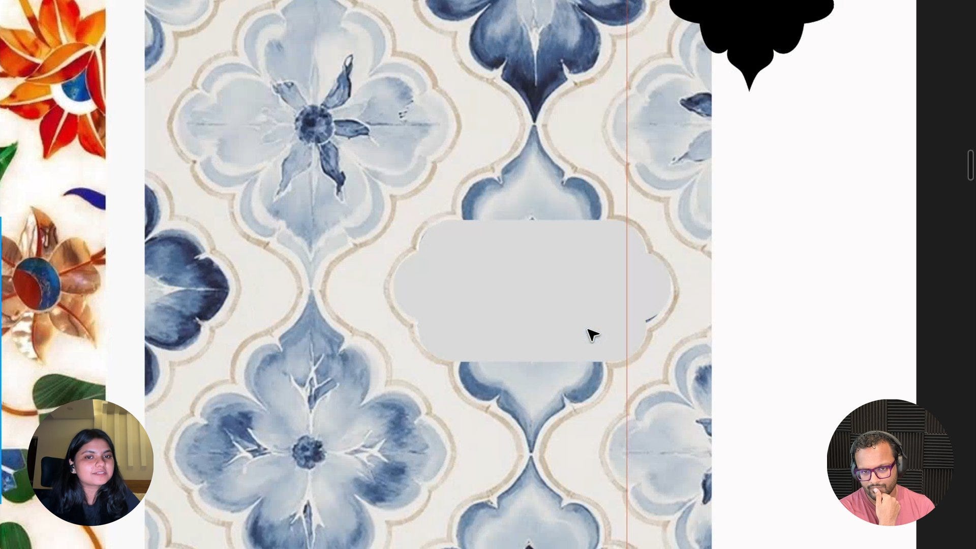
To design the most iconic brand India has ever seen you need to look for inspiration in the most unlikely places. Kamini studied the architectural plans for the Lotus Temple in Delhi and they heavily influenced the final Sarvam logo design. For the other brand assets she was heavily inspired by the patterns in their office bathroom tiles and turned them into shapes for the brand!
2. Tools and AI models are just an excuse
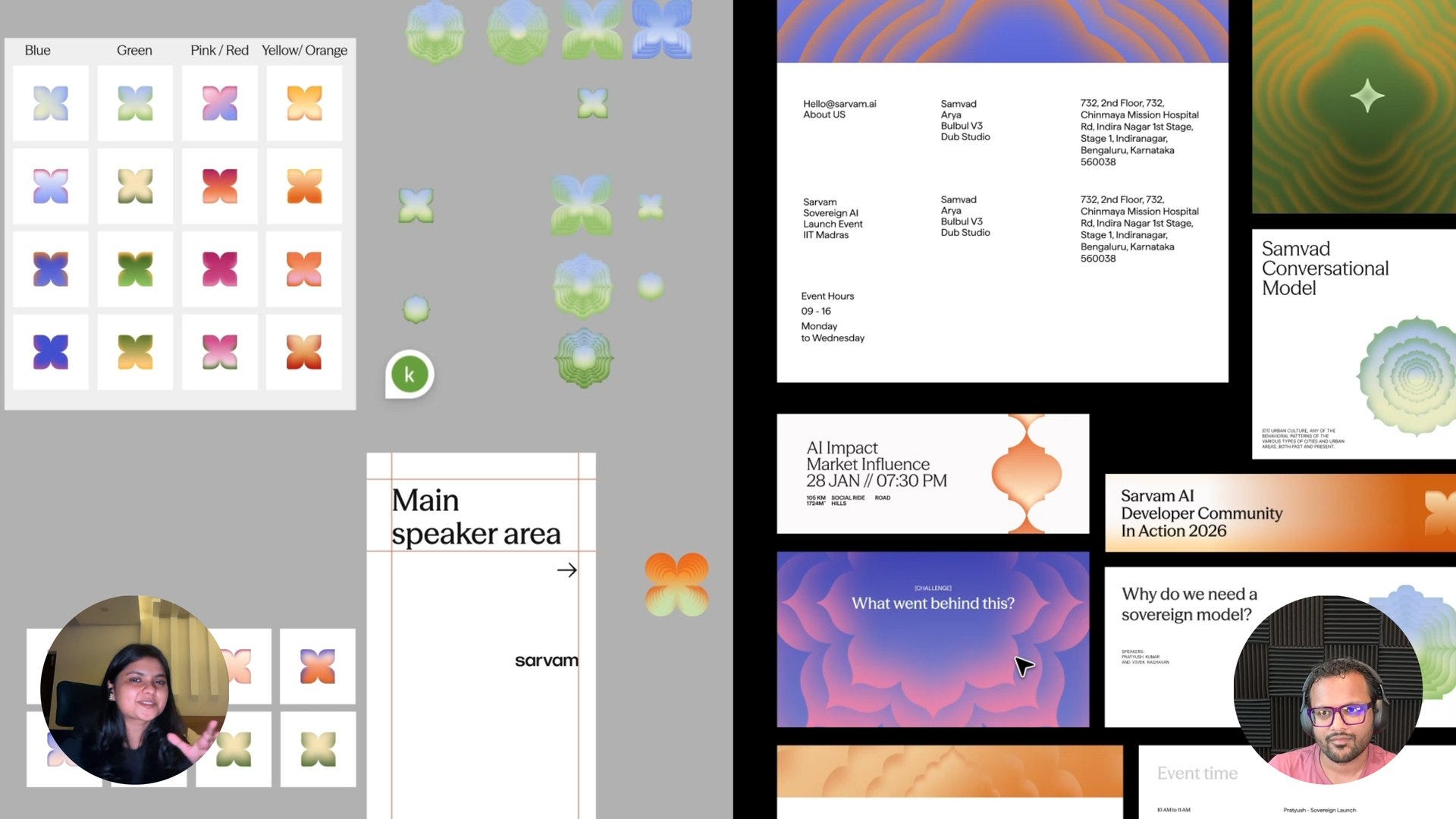
The entire brand design team at Sarvam AI works primarily in Figma and explores thousands of iterations painstakingly by hand. I feel this just goes to show that it’s less about using the latest tools or AI models and more about the designer’s desire to push the craft!
3. Designing a tech brand rooted in Indian culture
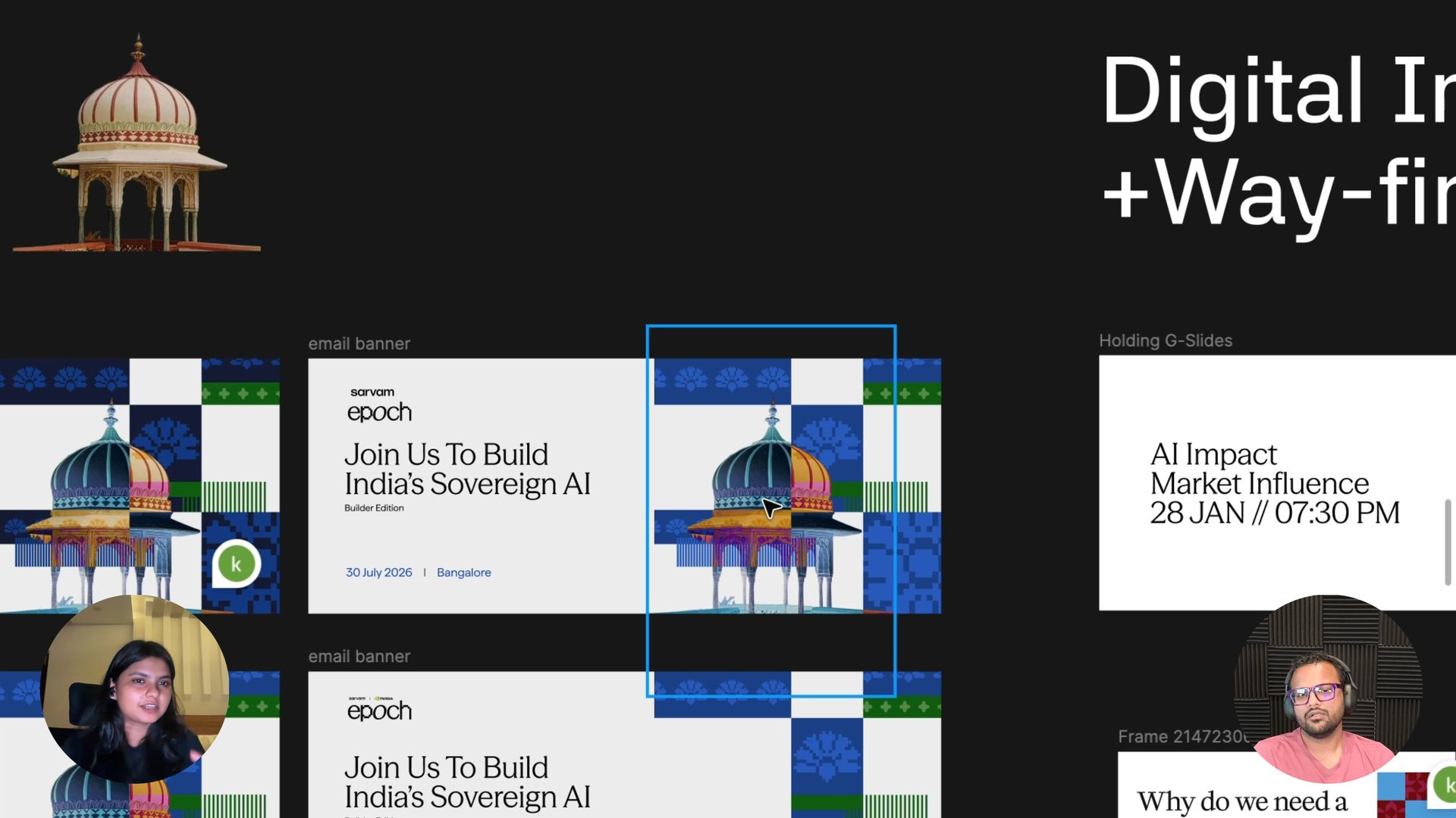
Sarvam’s brand had to feel Indian without being too traditional or feel techy without any connection to Indian roots. Kamini picked terracotta orange to give a feel of the Indian heritage and indigo blue to convey that it’s a tech brand. The team constantly asks “Is it too Indian or too tech?” to find the right balance in every brand iteration!
📺 Watch the full interview
🔓 Unlock AI & Growth Design Interviews
Refer Sneak Peek to your friends to unlock exclusive interviews on AI Design & Growth Design!